For La Voz users subscribing became irresistible
For the third time, we worked together with the La Voz team to update its image facing the audience. It is always comforting to be chosen by our clients again. It confirms that we are on the right track and that trust they place generates the necessary enthusiasm to continue creating.
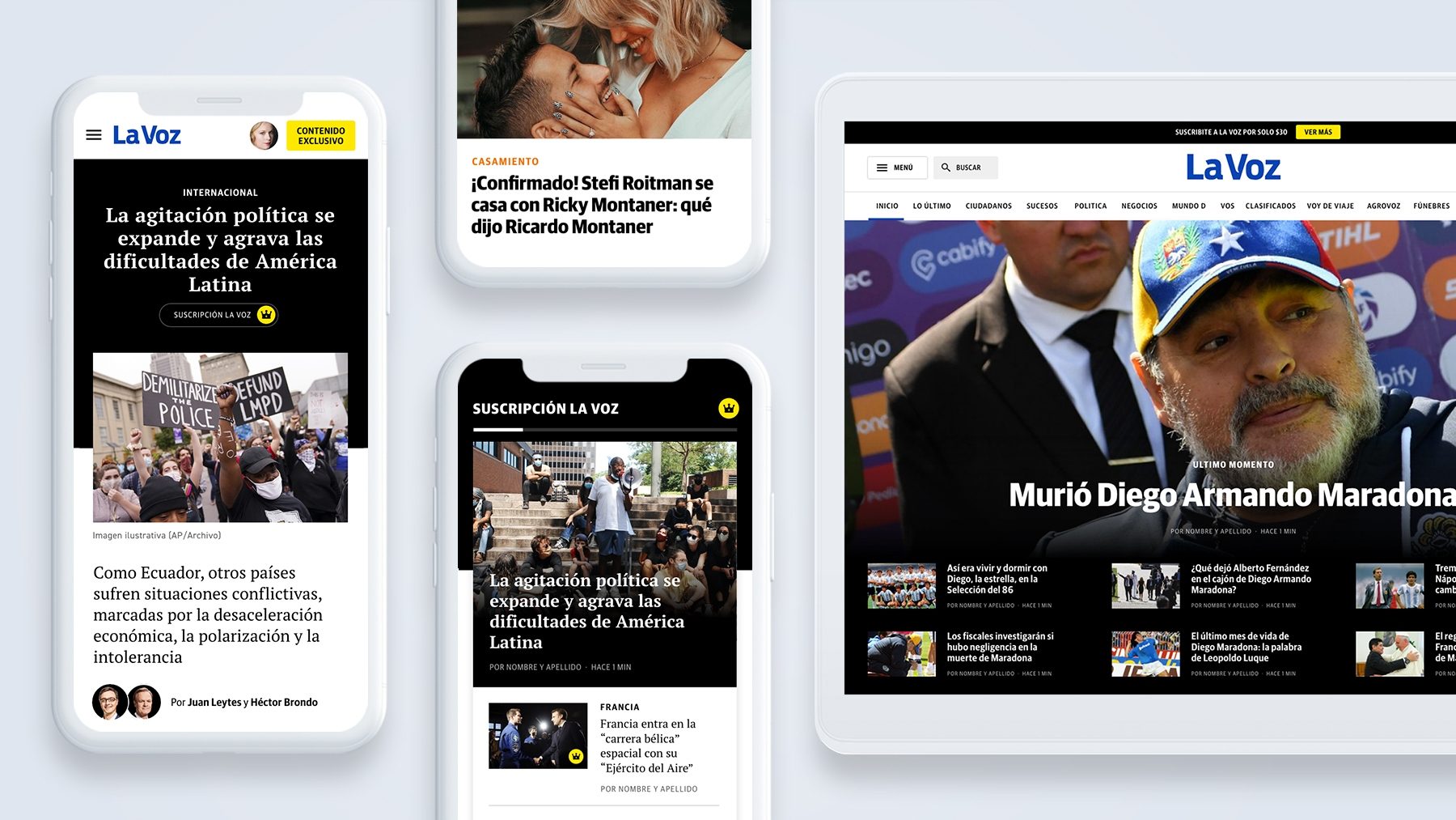
The main drivers of change for La Voz were to simplify the structure of the home page by a cleaner and easier-to-read one. We worked on a new look & feel with a minimalist spirit and better readability. Anyway, one of the biggest challenges was rethinking the subscription navigation interface and access to premium content.
Better organization without visual noise
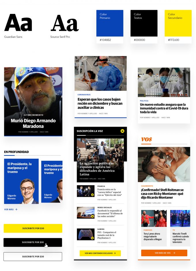
We composed a home page from a system of modules and repeated structures that also include some more complete options that support the hierarchical differentiation of information. To go along with the structural change, we replaced the typography with a sans serif that has a different visual weight, this provides greater typographic rhythm and generates order and good readability.
We think of the design as if it were a system where the news is located within flexible modules that adapt according to the type of content. At the same time, these modules are grouped by blocks. This way of approaching the design allows us to unify and simplify elements, order the content and achieve a more organized experience when searching for information.
In addition, we gave a greater identity weight to the blocks of La Voz satellite sites, now dominated by their respective logos and more saturated colors. We were able to do this since we are on rgb support that allows us to return to brighter colors unlike paper.
Generating an exclusive experience with a sense of belonging
A second aim of the project was to rethink the content that brings the product’s monetization. Every redesign is thought from a strategic business perspective without losing sight of the user experience.
We introduced sponsored news blocks and branded spaces. In this way we generated greater exposure for the sponsoring brands and a sense of transparency with the user from whom no information is hidden.
The biggest challenge was adjusting the navigation interface to access the premium notes. We created a circuit of subscriptions to exclusive content. We changed a totally business-centric landing for a friendlier one focused on the benefit of being a part (followed by the subscription forms).
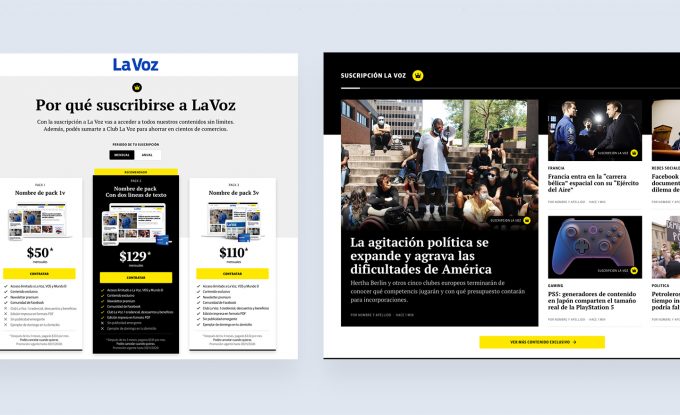
We now allow an introductive extract of the article’s content as an incentive to subscribe (which in turn grants a preview of the new style of the exclusive notes) followed by the invitation to subscribe. This accompanied by the subscription access boxes inserted within the common notes and the home page to obtain greater visibility without annoying the reading and complete the circuit.
Finally, we incorporated a home block that gathers only the selected notes for subscribers, each one with the crown as an identifying icon of the exclusivity that highlights the presence of this content and allows us to avoid frustrations or feelings of deception in users who still do not belong.
The result
On the screens of each of the users that are part of the La Voz community, today there is room for a cleaner, better structured site with great exclusive benefits that invite you to take part and make a difference in the experience of reading news.