Mi Claro
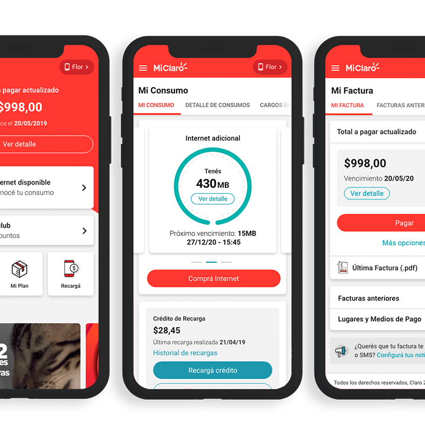
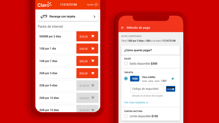
miclaro.claro.com.ar / miclaro.claro.com.uy / miclaro.claro.com.pyWhen we thought about how to continue improving the connection between Claro Latam and its clients, the answer was simple: prioritize its users’ experience. We started from the initial goal of migrating all the functionalities that the user already knew to a new app. In order to do so, we thought of a new design system that was solid, scalable and flexible. We investigated and analyzed the market, which gave us the focus to continue growing and creating new functionalities that make the experience an intuitive, simple and rewarding functionalobjects.com moment. Thanks to the user tests that we carry out, we can rightly tell that it is a product that will continue to evolve and grow in pursuit of the needs of the users.ss
What we did
- App
- Front-end engineering
- Html / CSS
- Javascript
- Mobile
- Responsive Design
- UI / New Design System
- User research
- UX strategy


